HOUSE EXTENSION DESIGN APPROACH
5 essential Tips & Hints, control costs make high impact
Rear and first floor side extension in Nottingham
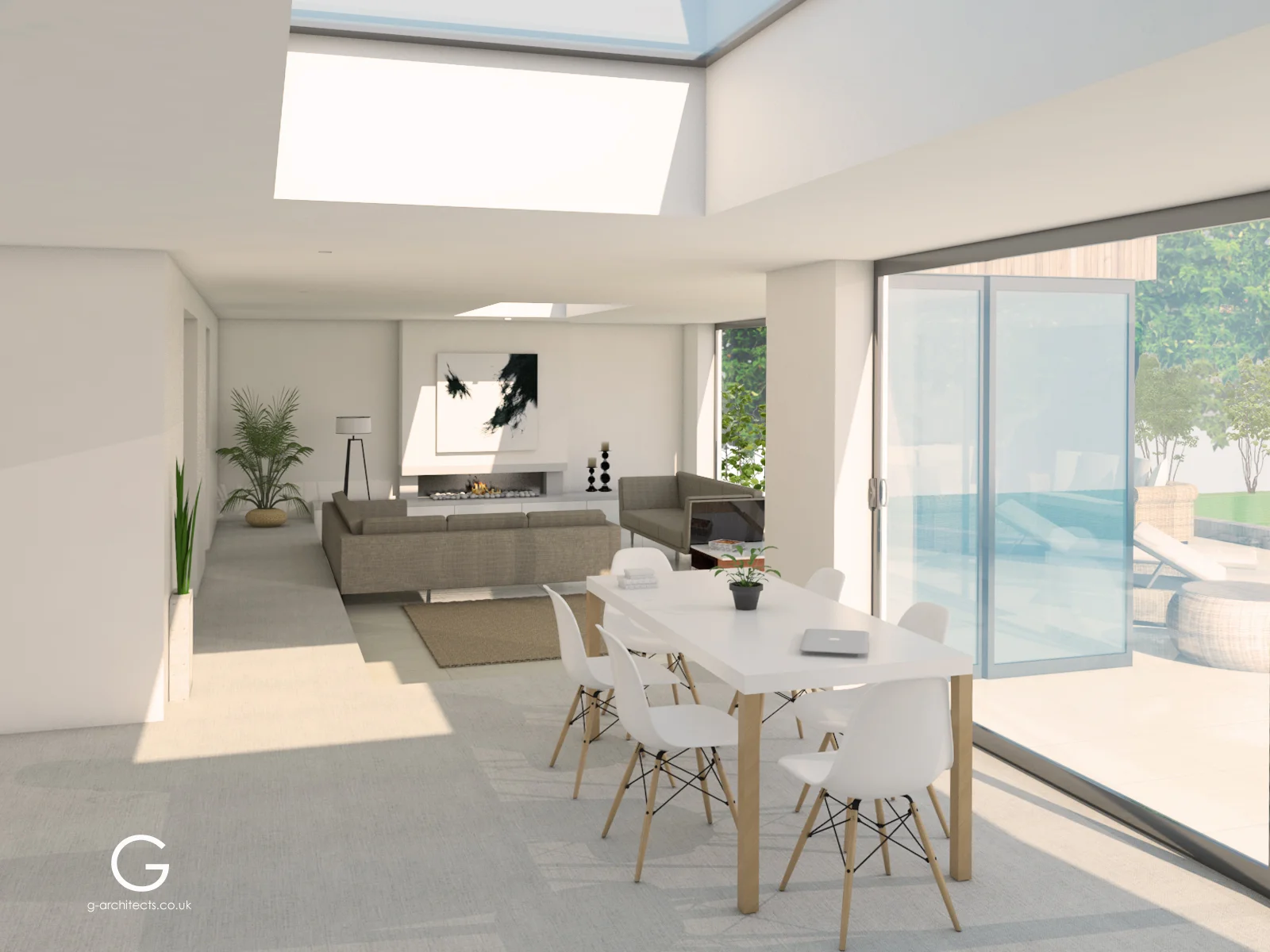
For this project the client’s main requirements were to increase the usable area of the property as much as possible, and to create an open-plan ground floor on which the kitchen, dining-room and lounge are inter-connected, and open out onto the garden and patio.
Also to add a master bathroom with dressing room at first floor level, through a new first floor side extension.
- The existing building :
The original house was probably built in the 1970s. The majority of houses from this period were functional in their design and tended to resemble boxes with pitched roofs. Then new extensions were built in a disorganized way over the years, probably in the early 2000s, unfortunately resulting in a rather unbalanced and unharmonious building , where past and present do not fit well together.
Existing Building
-Diagnosis, finding potential, assets and existing problems:
- Horizontal character:
One of the great qualities of the existing property, and its potential, are related to its horizontal character. We wanted to enhance this feature from every possible point of view , and it will be one of the main ideas behind the whole proposal.
-Garden :
In addition, the garden is quite flat and well levelled , which goes well with the horizontal primary concept noted above .
-Disconnected spaces and volumes:
Currently the existing new extensions and the plinth are disconnected visually and spatially from the original building, and existing openings are placed in a way which does not link spaces together, and does not appear balanced with the whole building.
- Poor relationship with the vast, rich garden space :
The main feature of this property is the garden, which is wide, long and full of trees and vegetation, so it will be a top priorty to link the internal space physically and visually with the garden.
Design Approach, 5 Essential Tips & Hints :
1 -Plinth :
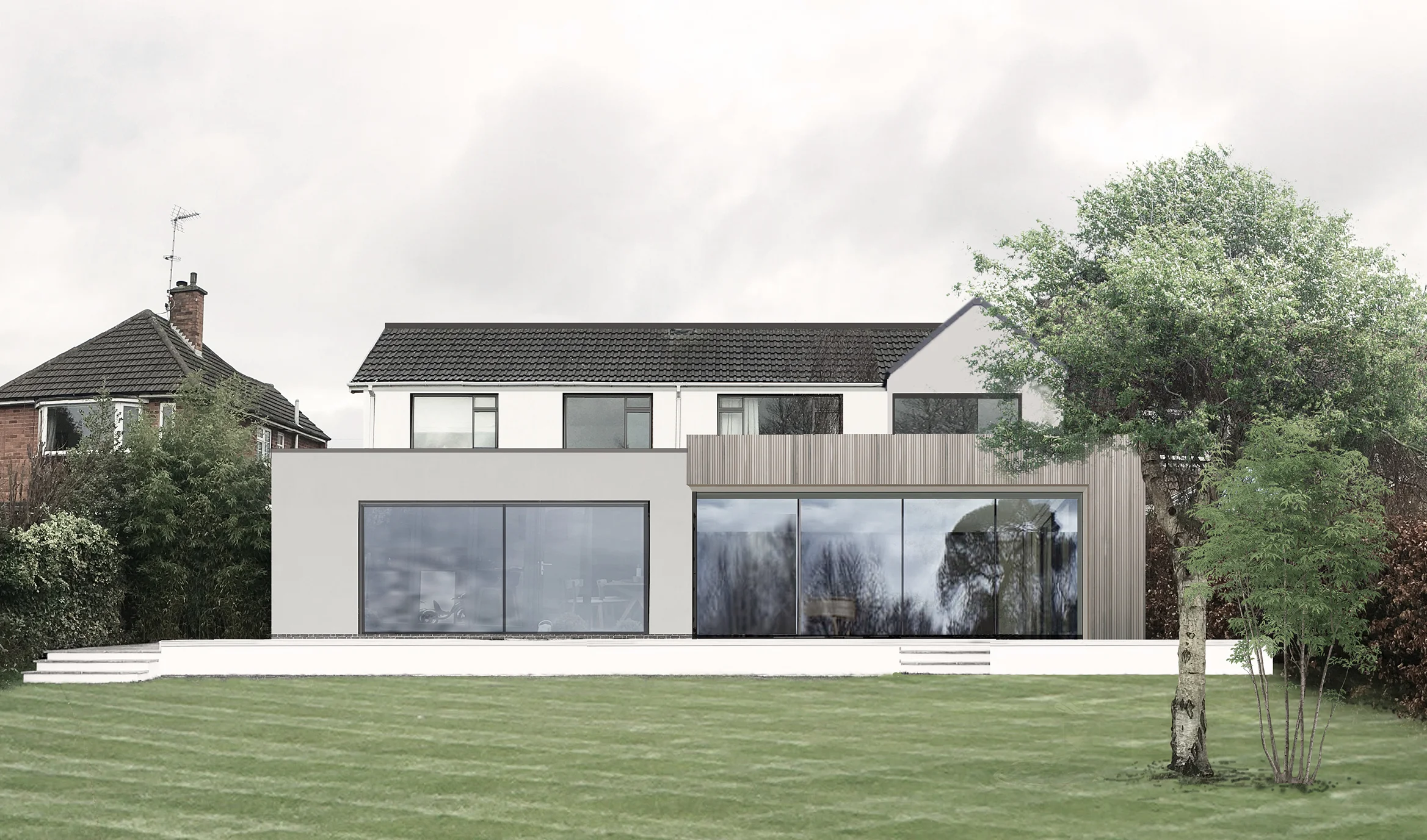
Rendered to match the proposed design, the plinth will be as wide and low as possible to enhance the horizontal character of the building. The proportions and location of the steps will provide a balanced rear view.
Cost Impact Ratio : Cost: Low / Impact: High
2 -Dark window frames, and aluminium copings to match them.
ALEZ Architecture & Interiors advises the use of top quality elements here ‒ the result is worth the extra cost. Extra thin ( below 25mm) aluminium frames could be the final touch ‒ the detail that reveals the overall quality and appearance of the whole building
-Dark grey aluminium frames v. white PVC-u: By using aluminuim we can aim for thinner frames, and the dark grey matches the glazed reflection colour when looking from outside, and unifies the whole opening.
-Thin frames ( below 25mm ) v.thicker frames: With thinner frames the whole construction looks generally crisper and better finished , but most of all you are not blocking your view from inside to outside, and whether you are looking at the sky or the garden, you want as little as possible in your way .
Cost Impact Ratio : Cost: Very High / Impact: High
3- Acrylic render and colours:
The acrylics make the render very durable and more flexible than traditional rendering, which means that it is much less likely to crack in the future
We have proposed an acrylic render to unify the whole property and to give it a more modern appearance, and we have proposed a light grey colour to differentiate and balance some of the elements ( in this case the rear and the side first floor extensions) , to highlight the fact that these are elements which have been added to the original building and to make the rear elevation more dynamic yet sober,and solid.
The big rear extension in timber cladding will stand out as the main feature and first role of the proposal, and will lead the whole composition.
Cost Impact Ratio : Cost: Low / Impact: High
4-Pitched roof first floor side extension:
We thought a lot about whether to propose a pitched roof extension or a flat roof to match the GF extension, and finally chose the pitched roof extension as a transitional element between the old and the new, between the ground floor, modern, minimalistic flat roof extension and the existing roof that crowns the property, links old and new nicely and smoothly, and covers the whole of the building’s volume. It was also one of the client´s requests to have a bolted ceiling in this space .
Cost Impact Ratio : Cost: Low / Impact: High
5- Floating corner at GF extension and at FF side extension:
This is a way to match the GF and FF levels.It should also be noted that the size and appearance of the new side extension opening/window match those on that elevation, enhancing horizontality and continuity.
Cost Impact Ratio : Cost: Medium / Impact: High
Internal View
Conclusion :
We have tried to achieve a balanced building which has been renovated to have a modern look, but we have not rejected the original features and character of the existing building, and we have enhanced the hidden value of the property to the maximum.
This is a simplified guide and is not a conclusive source of legal information. Land constraints might affect your development. A legal professional will be able to provide precise advice on this if needed.
Thank you for taking the time to read this article, we look forward to hearing from you so please do not hesitate to get in touch.
Recommended Reading:


